
Last updated: July 19, 2026
Quick Answer: A pivot table in Excel lets you summarize, group, and analyze large datasets in seconds, without writing a single formula. Select your data, go to Insert → PivotTable, drag fields into the Rows, Columns, Values, and Filters areas, and Excel does the heavy lifting. This guide covers everything from setup to pivot charts, date grouping, calculated fields, and common mistakes to avoid.
Key Takeaways 🎯
- Pivot tables work by dragging and dropping fields, no formulas required for most summaries.
- Always format your source data as an Excel Table (Ctrl+T) before building a pivot table so it expands automatically.
- Group dates by month, quarter, or year with a single right-click.
- Pivot charts are linked directly to your pivot table and update when you change filters.
- Use Refresh All (or set auto-refresh on open) to keep pivot tables current when source data changes.
- Power Query is better than pivot tables for cleaning messy data; pivot tables are better for summarizing clean data.
- Excel 365 in 2026 supports pivot tables connected to external data sources, including Power BI datasets and SharePoint lists.
- Row limits are not a practical concern for most users, Excel handles over 1 million rows per sheet.
What Is a Pivot Table in Excel and Why Do You Need One?
A pivot table is a built-in Excel tool that reorganizes and summarizes data from a list or table into a compact, readable report, instantly. Instead of writing SUMIF or COUNTIF formulas across dozens of columns, you drag a field name into a box and Excel calculates the totals automatically.
Who it’s for: Anyone who works with lists of data, sales records, student grades, expense reports, inventory logs, or survey results. If your data has more than 20 rows and at least two columns, a pivot table will save time.
Who it’s NOT for: If your data is already a single summary table (not raw rows), a pivot table adds no value. It also won’t fix messy or inconsistent data, clean that up first. Check out the guide on how to remove duplicates in Excel before building your pivot table if your source data looks suspect.
Quick example: Imagine a spreadsheet with 500 rows of sales transactions, each row has a date, salesperson name, product, and amount. A pivot table can show total sales by salesperson, by product, or by month in about 30 seconds.
How to Create a Pivot Table in Excel Step by Step
Building a pivot table takes under a minute once your data is clean [7]. Here’s the exact process:
Step 1, Prepare your data
- Make sure every column has a header (no blank headers).
- Remove blank rows inside the data range.
- Convert the range to an Excel Table: click anywhere in the data, press Ctrl+T, confirm the range.
Step 2, Insert the pivot table
- Click any cell inside your data.
- Go to Insert → PivotTable (or try Insert → Recommended PivotTables if you want Excel to suggest layouts automatically [6]).
- Choose New Worksheet (recommended) or Existing Worksheet.
- Click OK.
Step 3, Build your report
- The PivotTable Fields pane opens on the right.
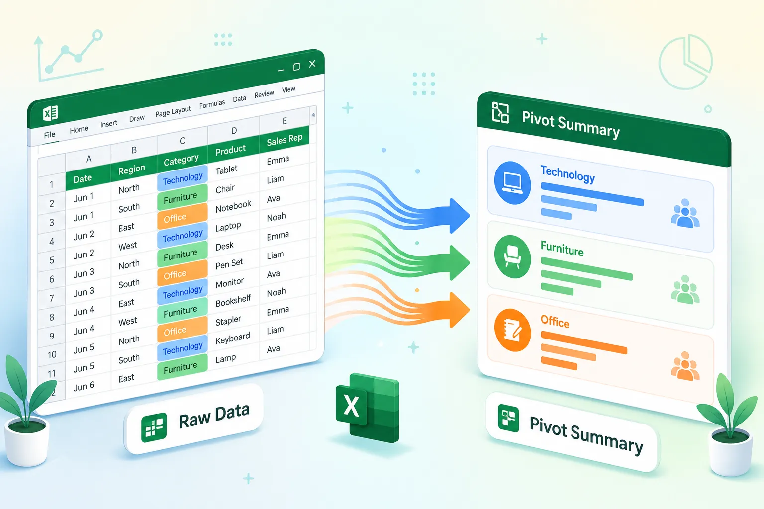
- Drag a field (e.g., “Salesperson”) to the Rows area.
- Drag a numeric field (e.g., “Amount”) to the Values area, Excel defaults to SUM.
- Drag a category field (e.g., “Product”) to Columns for a cross-tab view.
- Drag any field to Filters to add a report-level filter at the top.
Step 4, Format and rename
- Click a value cell, right-click → Number Format to add currency or commas.
- Double-click the “Sum of Amount” header in the pivot table to rename it to something readable like “Total Sales.”
💡 Pro tip: If you’re new to Excel generally, the how to use Excel for beginners step by step guide is a solid starting point before tackling pivot tables.
Pivot Tables vs. Formulas: Which Should You Use?
Pivot tables are faster and more flexible than formulas for summarizing data, but formulas are better when you need calculations embedded in a fixed layout. Here’s the practical breakdown:
| Scenario | Use Pivot Table | Use Formulas |
|---|---|---|
| Summarize sales by region | ✅ | Possible but slow |
| Dynamic grouping by date | ✅ | Complex with SUMIFS |
| Fixed dashboard cell references | , | ✅ |
| Conditional logic (IF-based) | Limited | ✅ |
| One-click refresh on new data | ✅ | Manual update needed |
Common mistake: Many users build elaborate SUMIF or COUNTIF formula arrays for reports that a pivot table would handle in 60 seconds. If you find yourself writing formulas across an entire column, ask whether a pivot table would do the same job faster.
For deeper formula work alongside pivot tables, the guide to writing spreadsheet formulas covers when formulas genuinely add value.
How to Group Data by Date in a Pivot Table
Right-click any date field in the Rows area of your pivot table and select Group, Excel will let you group by days, months, quarters, or years in one step. This is one of the most useful features in Excel Pivot Tables for 2026.
Step-by-step:
- Add your date column to the Rows area.
- Right-click any date value in the pivot table.
- Select Group.
- Choose one or more groupings: Months, Quarters, Years.
- Click OK, Excel creates a grouped hierarchy automatically.
Edge case: If your date column contains text that looks like dates (e.g., “01/15/2026” stored as text), the Group option will be grayed out. Fix this by converting the column to real dates first. The Excel date functions guide can help with date formatting issues.
How to Add a Chart to Your Pivot Table for Visualization
A pivot chart is a chart that’s directly connected to a pivot table, when you change a filter or grouping in the pivot table, the chart updates instantly. This makes it far more powerful than a standard chart for reporting.
To insert a pivot chart:
- Click anywhere inside your pivot table.
- Go to Insert → PivotChart.
- Choose a chart type (bar, column, and line charts work best for most pivot data).
- Click OK, the chart appears on the same sheet.
For situations where your raw data isn’t already summarized, pivot charts are especially useful. See why pivot charts work when your data isn’t pre-summarized for a practical walkthrough.
You can also quickly filter data directly from a chart using the field buttons that appear on pivot charts, a feature many users miss.

How to Filter a Pivot Table by Multiple Criteria
Pivot tables support three types of filtering: the Filters area (report filter), Slicers, and Timelines. For multiple criteria, slicers are the most visual and user-friendly option.
Adding slicers:
- Click inside the pivot table.
- Go to PivotTable Analyze → Insert Slicer.
- Check the fields you want to filter by (e.g., Region, Product, Salesperson).
- Click OK, each slicer appears as a clickable button panel.
- Hold Ctrl and click multiple buttons in a slicer to select more than one value.
Timelines work the same way but are specific to date fields, they show a visual slider for filtering by month or quarter.
Decision rule: Use slicers when sharing the file with non-Excel users who need a simple click-to-filter experience. Use the Filters area when you want a compact, dropdown-style filter at the top of the pivot table.
How to Calculate Percentages and Running Totals in a Pivot Table
Pivot tables can show values as percentages of totals or as running (cumulative) totals without any extra formulas. Right-click a value in the Values area, select Show Values As, and choose from options like % of Grand Total, % of Row Total, Running Total In, or % Running Total In.
Practical example for a sales report:
- Drag “Amount” to Values twice.
- Leave the first as “Sum of Amount” (raw total).
- Right-click the second → Show Values As → % of Grand Total.
- Now you see both the dollar total and the percentage share side by side.
Calculated fields let you add custom math. Go to PivotTable Analyze → Fields, Items & Sets → Calculated Field, enter a name (e.g., “Profit Margin”), and write a formula using existing field names (e.g., =Profit/Revenue).
Pivot Table Not Refreshing When Source Data Changes, How to Fix
Pivot tables do NOT update automatically when you edit source data. You must refresh them manually, or configure auto-refresh on file open.
Manual refresh: Right-click anywhere in the pivot table → Refresh. Or press Alt+F5.
Refresh all pivot tables at once: Go to Data → Refresh All (or press Ctrl+Alt+F5).
Auto-refresh on file open:
- Right-click the pivot table → PivotTable Options.
- Go to the Data tab.
- Check Refresh data when opening the file.
Root cause of most refresh failures: The source data range expanded beyond the original selection. This is exactly why formatting your data as an Excel Table (Ctrl+T) before building the pivot table matters, Excel Tables expand the pivot table’s data source automatically when new rows are added.
Should You Use Pivot Tables or Power Query for Data Analysis?
Pivot tables summarize clean, structured data. Power Query cleans, reshapes, and combines messy data before analysis. For most users in 2026, the best workflow is Power Query first, then pivot table.
Choose a pivot table if:
- Your data is already clean and in one table.
- You need quick summaries, groupings, or cross-tabs.
- You want a visual, drag-and-drop experience.
Choose Power Query if:
- You need to combine data from multiple sheets or files.
- Your data has inconsistent formatting, extra header rows, or merged cells.
- You want to automate a repeatable data cleaning process.
These tools complement each other well, Power Query feeds clean data into a pivot table for the final summary step.
What’s New with Pivot Tables in Excel 2024, 2025, and 2026
Excel 365 has added several quality-of-life improvements to pivot tables over the past two years. The most notable updates for 2026 include:
- Recommended PivotTables, Excel analyzes your data and suggests pre-built layouts, making it faster to get started [6].
- Copilot integration, Microsoft 365 Copilot can now generate pivot tables from a plain-English prompt (e.g., “Show me total sales by region by quarter”).
- External data connections, Pivot tables can now connect directly to Power BI datasets, SharePoint lists, and Azure SQL sources without leaving Excel [7].
- Improved date grouping, Automatic date hierarchy detection is more reliable in the 2025/2026 builds.
- Dynamic array spill support, Some pivot table outputs can now feed into FILTER and SORT dynamic array formulas for hybrid reporting.
Can Pivot Tables Work with Data from Different Sheets or External Sources?
Yes. Excel pivot tables support multiple data sources through the Data Model (Power Pivot). When creating a pivot table, check the box that says Add this data to the Data Model, this lets you build relationships between tables on different sheets, similar to a simple database [7].
For external sources, go to Data → Get Data (Power Query), load the external data into Excel, then build a pivot table on top of it. This works with CSV files, SQL databases, SharePoint lists, and web data.
Is There a Limit to How Many Rows a Pivot Table Can Handle?
Excel’s worksheet limit is 1,048,576 rows, and pivot tables can summarize all of them. For datasets larger than that, use the Data Model (Power Pivot), which handles tens of millions of rows stored in memory-efficient columnar format.
Practical performance tips for large datasets:
- Avoid adding too many fields to the Rows area, this creates a very tall pivot table that slows rendering.
- Turn off AutoFit column widths on update in PivotTable Options to speed up refresh.
- Use Defer Layout Update (checkbox at the bottom of the Fields pane) when dragging multiple fields at once.
Common Mistakes People Make When Building Pivot Tables
Even experienced users run into these issues regularly:
- No column headers, Pivot tables break if any column header is blank.
- Mixed data types in one column, Numbers stored as text won’t sum correctly. Fix with Excel text functions or the VALUE() function.
- Not using an Excel Table as the source, Static ranges don’t expand when new data is added.
- Forgetting to refresh, The most common complaint: “My pivot table is wrong” usually means it wasn’t refreshed after data changed.
- Putting too many fields in Rows, This creates an unreadable wall of text. Use Columns or Slicers to split dimensions instead.
- Deleting the source data, The pivot table cache keeps a copy, but editing or refreshing will fail without the source.
FAQ
Q: Do I need to know formulas to use pivot tables? No. Basic pivot tables require no formulas at all. You drag fields into areas and Excel calculates sums, counts, and averages automatically. Calculated fields let you add custom formulas later if needed.
Q: Can I use a pivot table on a Mac? Yes. Pivot tables work in Excel for Mac with the same core functionality. Some advanced features like Power Pivot are Windows-only as of 2026.
Q: How do I stop a pivot table from grouping dates automatically? Right-click a date in the pivot table → Ungroup. To prevent auto-grouping permanently, go to File → Options → Data and uncheck Disable automatic grouping of Date/Time columns in PivotTables.
Q: Can two pivot tables share the same slicer? Yes. Right-click a slicer → Report Connections → check all pivot tables you want the slicer to control. This is great for dashboards.
Q: Why does my pivot table show “blank” as a row item? Blank cells in the source data appear as “(blank)” in the pivot table. Filter them out by unchecking “(blank)” in the Row Labels dropdown, or clean the source data first.
Q: Can I copy a pivot table to another workbook? Yes, copy and paste. If you paste as values only (Ctrl+Shift+V → Values), you get a static snapshot. If you paste the full pivot table, it brings its data cache along.
Q: What’s the difference between a pivot table and a pivot chart? A pivot table is a data summary grid. A pivot chart is a visual chart built from that grid. They’re linked, changes to one affect the other.
Q: How do I show top 10 results in a pivot table? Click the dropdown arrow next to a Row Label → Value Filters → Top 10. Set the number and the value field to rank by.
Conclusion: Start Summarizing Smarter in 2026
Excel Pivot Tables for 2026: A Step-by-Step Guide to Summarizing, Grouping, and Visualizing Your Data covers everything needed to go from raw data to a polished, interactive report. The core workflow, clean data, Insert → PivotTable, drag fields, refresh, takes minutes to learn and saves hours every week.
Actionable next steps:
- Start small. Take any list you already have (expenses, grades, sales) and build one pivot table today using the steps above.
- Format your source as a Table (Ctrl+T) before you build, this single habit prevents 80% of refresh problems.
- Add a slicer to your first pivot table so you can filter with one click.
- Insert a pivot chart to visualize the summary, see the pivot charts tip for guidance on chart types.
- Explore Power Query once you’re comfortable, it pairs perfectly with pivot tables for more complex data sources.
If you’re building a financial report, the balance sheet template guide shows how pivot tables fit into a broader Excel reporting workflow.
References
[6] Pivot Table Pro Tips – https://www.xelplus.com/pivot-table-pro-tips/ [7] Create A Pivottable To Analyze Worksheet Data – https://support.microsoft.com/en-us/excel/get-started/create-a-pivottable-to-analyze-worksheet-data