
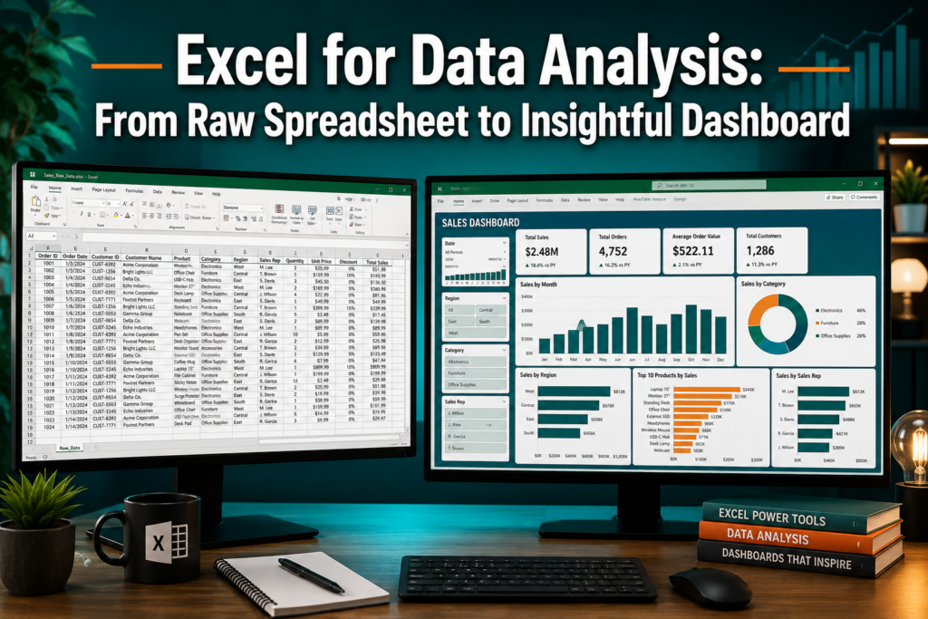
Last updated: July 9, 2026
Quick Answer: Excel for data analysis covers the full journey from raw spreadsheet to insightful dashboard using built-in tools like Tables, PivotTables, PivotCharts, and formulas. You clean your data first, structure it as an Excel Table, summarize it with PivotTables, then visualize it with charts and slicers. Most business analysts can complete this workflow without any coding or specialist software.
Key Takeaways
- Clean data first, errors, blanks, and duplicates will break your analysis before it starts.
- Convert ranges to Excel Tables (Ctrl+T) to make PivotTables and formulas more reliable.
- PivotTables are the fastest way to summarize hundreds of rows into meaningful totals and averages.
- Dashboards in Excel combine PivotCharts, slicers, and conditional formatting on one sheet, no extra software needed.
- Essential formulas for analysis: SUM, AVERAGE, COUNTIF, VLOOKUP/XLOOKUP, IF, and SUMIFS.
- Excel handles datasets up to ~1 million rows per sheet; beyond that, SQL or Power Query is a better fit.
- Microsoft 365 subscribers can share live dashboards through Microsoft 365 Groups [8].
- Excel’s “Analyze Data” AI feature can auto-suggest PivotTables and charts from your raw data [3].
- Most people reach a working analysis skill level in 20-40 hours of focused practice.
- Excel suits business analysts and non-programmers well; data scientists typically graduate to Python or R for complex modeling.
What Is Data Analysis in Excel and Why Do You Need It?
Data analysis in Excel means using the program’s built-in tools to turn raw numbers into clear answers. Instead of staring at thousands of rows, you summarize, filter, and visualize data so patterns and problems become obvious.
Most professionals already have Excel. That makes it the lowest-friction starting point for anyone who needs to answer questions like “Which product sold the most last quarter?” or “Where are costs rising?” The Excel for Data Analysis: From Raw Spreadsheet to Insightful Dashboard workflow is now taught as a standard repeatable process at professional analytics events in 2026 [5], because it works for a huge range of business tasks without requiring a data science background.
Who benefits most:
- Small business owners tracking sales or inventory
- Finance teams building budget reports
- HR professionals summarizing headcount data
- Operations staff monitoring KPIs
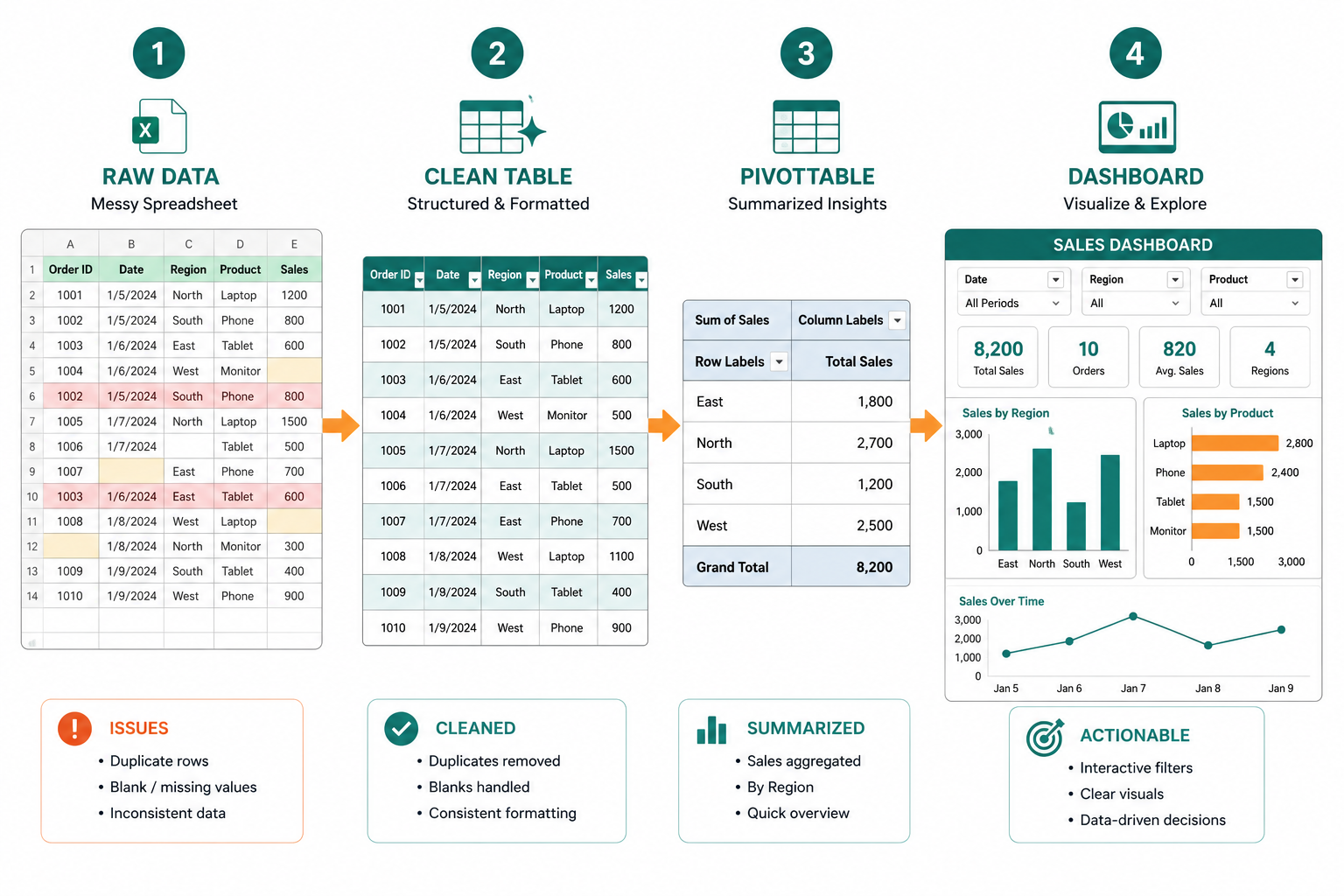
How Do I Clean Messy Data in Excel Before Analysis?
Dirty data is the number-one reason Excel analysis goes wrong. Clean your data before touching a PivotTable or formula, or your results will be unreliable.
Step-by-step data cleaning checklist:
- Remove duplicates, Data tab → Remove Duplicates.
- Fix blank cells, Use Find & Select → Go To Special → Blanks to locate and fill or delete them.
- Standardize text, Use
TRIM()to remove extra spaces,PROPER()orUPPER()to fix inconsistent capitalization. - Check date formats, Dates stored as text won’t sort or calculate correctly. Use
DATEVALUE()to convert them. - Validate numbers, Look for numbers stored as text (left-aligned in cells). Use
VALUE()to convert. - Remove formatting noise, Extra merged cells, colored headers, and blank rows above the data all cause problems.
💡 Quick tip: Before cleaning, always save a copy of the original raw file. Label it “RAW_data_backup” so you never lose the source.
If you’re entering data fresh, building good habits from the start saves hours of cleanup later. See this guide on how to use Excel for data entry for a solid foundation.
What Are Pivot Tables and How Do They Help With Data Analysis?
A PivotTable is Excel’s most powerful summarization tool. It lets you drag and drop fields to instantly count, sum, or average data across any category, no formulas required.
Example: If you have 5,000 rows of sales transactions, a PivotTable can show total sales by region, by product, and by month in about 30 seconds.
How to create one:
- Click anywhere inside your clean data range.
- Press Ctrl+T to convert it to an Excel Table (this keeps the PivotTable updated automatically).
- Go to Insert → PivotTable.
- Drag fields into Rows, Columns, and Values areas.
- Right-click the Values area to change the summary from Sum to Average, Count, etc.
Common PivotTable mistake: Leaving blank column headers. Every column must have a header, or Excel will refuse to build the PivotTable.
Microsoft’s official dashboard workflow centers on Tables and PivotTables as the foundation for every analysis [8]. Once you’re comfortable with PivotTables, adding PivotCharts takes only one extra click.
What Formulas Do I Need to Know for Data Analysis?
For most business data analysis, six formula categories cover the majority of real-world tasks.
| Formula | What It Does | Example Use |
|---|---|---|
| SUM / SUMIFS | Adds numbers with optional conditions | Total sales for one region |
| AVERAGE / AVERAGEIFS | Calculates mean with optional filters | Average order value by product |
| COUNTIF / COUNTIFS | Counts cells matching criteria | How many orders exceeded $500 |
| XLOOKUP / VLOOKUP | Pulls data from another table | Match product ID to product name |
| IF / IFS | Returns values based on conditions | Flag orders as “High” or “Low” value |
| TEXT / DATEVALUE | Formats or converts dates and text | Extract month name from a date |
For basic totals, the SUM function guide is a good starting reference. For pricing and quantity calculations, this walkthrough on how to calculate quantity and price in Excel covers practical scenarios.
Can I Create Dashboards in Excel, or Should I Use Something Else?
Yes, Excel can produce fully functional interactive dashboards. The standard approach combines PivotCharts, slicers, and timelines on a single dedicated sheet [8].
Basic dashboard build steps:
- Keep all raw data on a separate “Data” sheet.
- Build PivotTables on a hidden “Calc” sheet.
- Insert PivotCharts from those PivotTables.
- Move charts to a blank “Dashboard” sheet.
- Add slicers (Insert → Slicer) to filter all charts simultaneously.
- Add a timeline slicer for date-based filtering.
- Use conditional formatting to add color-coded KPI indicators.
Excel’s built-in “Analyze Data” feature (found on the Home tab) can auto-suggest chart types and PivotTable layouts when you’re not sure where to start [3]. It’s especially useful for first-time dashboard builders.
For visual polish, conditional formatting traffic lights are a quick way to make KPIs stand out at a glance. You can also turn Excel data into a graph with just a few clicks to add visual impact.
Microsoft 365 users can share live dashboards through Microsoft 365 Groups, so team members always see the latest version without emailing files back and forth [8].
Excel vs Power BI for Data Analysis: Which Is Better?
Excel is better for most business analysts who need quick, flexible analysis without IT involvement. Power BI is better when you need live data connections, complex data models across many tables, or organization-wide reporting at scale.
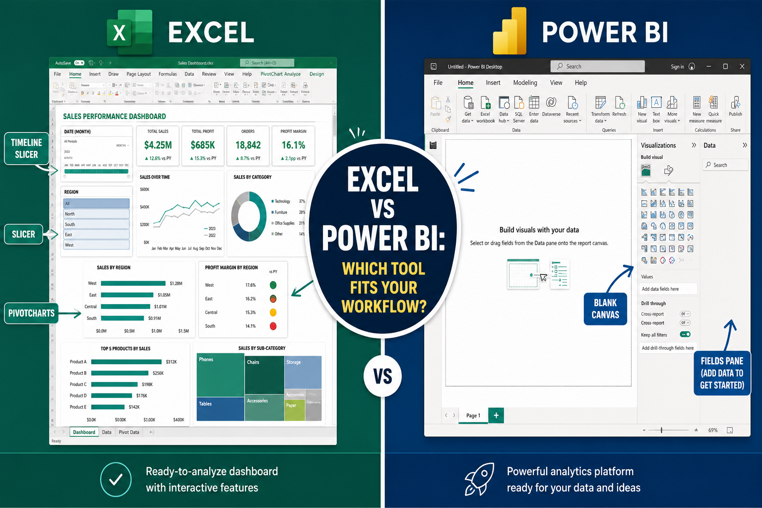
Choose Excel if:
- Your dataset fits within one million rows
- You need to share a file with people who don’t have Power BI licenses
- You want to combine analysis and reporting in one tool
- You’re already comfortable with spreadsheets
Choose Power BI if:
- You’re pulling from databases, APIs, or live cloud sources daily
- You need role-based access and enterprise governance
- Your reports serve dozens of stakeholders with different data views
The Excel for Data Analysis: From Raw Spreadsheet to Insightful Dashboard workflow covers the vast majority of small-to-medium business needs without the learning curve or cost of a dedicated BI tool.
How Much Does Excel Cost and Do I Need a Subscription?
Excel is available as part of Microsoft 365 (subscription) or as a one-time purchase through Microsoft 365 Personal/Family or Microsoft 365 Business plans. As of 2026, Microsoft 365 Personal starts at approximately $6.99/month (USD), which includes Excel, Word, PowerPoint, and 1TB of OneDrive storage.
A one-time purchase of Microsoft Office Home & Student 2024 is also available for around $149.99 (USD) and includes Excel without a recurring fee, but it doesn’t include cloud features or the “Analyze Data” AI tool [3].
Free options:
- Excel for the web (free with a Microsoft account) covers basic analysis but lacks PivotChart slicers and some advanced features.
- Google Sheets is free and handles similar tasks, though PivotTable functionality is more limited.
Is Excel Good Enough for Large Datasets, or Should I Use SQL?
Excel handles up to 1,048,576 rows per sheet. For most business reporting, that’s more than enough. But performance slows noticeably above 100,000 rows with complex formulas, and Excel isn’t designed for relational queries across multiple large tables.
Use SQL (or Power Query) instead when:
- Your dataset exceeds 500,000 rows regularly
- You need to join multiple large tables on the fly
- Data lives in a database and needs to stay there
- Speed and reproducibility matter more than flexibility
Power Query (built into Excel) is a strong middle ground. It can pull data from databases, clean it automatically, and load only a summary into Excel, so you get SQL-style data handling without leaving the spreadsheet environment.
Who Should Use Excel for Data Analysis vs Data Scientists?
Excel suits business analysts, finance professionals, operations managers, and anyone who needs to answer practical business questions from structured data. Data scientists typically need Excel for data analysis as a starting skill, but they move to Python, R, or SQL for statistical modeling, machine learning, and large-scale automation.
Excel is the right tool if you:
- Work with structured tabular data (sales, HR, finance, inventory)
- Need to share results with non-technical stakeholders
- Don’t need statistical modeling beyond regression or correlation
Move beyond Excel if you:
- Build predictive models or run A/B tests
- Work with unstructured data (text, images, logs)
- Need version-controlled, reproducible analysis pipelines
What Are Common Mistakes When Analyzing Data in Excel?
Even experienced users make these errors. Knowing them in advance saves significant rework.
- Not converting data to a Table first, formulas and PivotTables won’t auto-expand when new rows are added.
- Mixing data types in one column, numbers and text in the same column break SUM and AVERAGE.
- Hardcoding values in formulas, typing
*1.1instead of referencing a cell makes updates painful. - No data validation, without it, typos create phantom categories in PivotTables (e.g., “North” vs “north”).
- Overwriting source data, always keep a raw backup sheet.
- Circular references, a formula that refers back to its own cell will either error or give wrong results silently.
How Long Does It Take to Learn Excel for Data Analysis?
Most people reach a functional level, cleaning data, building PivotTables, and creating basic dashboards, in 20 to 40 hours of focused practice. That’s roughly two to four weeks if you practice for an hour each day.
Reaching an advanced level (complex formulas, Power Query, macro automation) typically takes three to six months of regular use. The fastest path is working on real data problems rather than generic tutorials.
If you’re starting from scratch, the Excel for beginners guide is a practical first step before tackling analysis workflows.
Can I Automate Data Analysis in Excel With Macros?
Yes. Excel’s macro recorder (Developer tab → Record Macro) captures repetitive steps and replays them with one click. For more control, VBA (Visual Basic for Applications) lets you write custom automation scripts.
Good candidates for macro automation:
- Importing and cleaning a new monthly data file
- Refreshing all PivotTables and saving a PDF report
- Applying consistent formatting to new data
Limitation: Macros are tied to the file and can break if the data structure changes. For more reliable automation, Power Query is often a better choice because it’s formula-based and easier to maintain.
What If My Data Is in Multiple Excel Files? How Do I Combine Them?
Power Query is the cleanest solution for combining data from multiple Excel files. It’s built into Excel (Data tab → Get Data) and requires no coding.
Steps to combine multiple files:
- Store all files in one folder with consistent column structures.
- Go to Data → Get Data → From File → From Folder.
- Select the folder and click Combine & Transform.
- Power Query stacks all files automatically and lets you clean before loading.
- Load the combined table into Excel, then build your PivotTable on top of it.
For simpler cases (two or three files), copy-paste with Paste Special → Values works fine. Just make sure column headers match exactly before combining.
How Do I Fix Errors in My Excel Data Analysis?
The most common Excel errors in analysis work have straightforward fixes.
| Error | Likely Cause | Fix |
|---|---|---|
#REF! |
Formula references a deleted cell | Update the formula range |
#VALUE! |
Wrong data type in formula | Check for text in numeric columns |
#N/A |
VLOOKUP/XLOOKUP can’t find a match | Use IFERROR() to handle missing values |
#DIV/0! |
Dividing by zero or blank cell | Wrap in IF() to check for zero first |
#NAME? |
Misspelled function name | Check spelling; use formula autocomplete |
For #N/A errors specifically, wrapping your lookup in IFERROR(XLOOKUP(...),"Not Found") keeps the sheet readable without hiding genuine data problems.
Conclusion: Your Next Steps Toward a Working Dashboard
The Excel for Data Analysis: From Raw Spreadsheet to Insightful Dashboard workflow follows a clear sequence: clean your data, structure it as a Table, summarize with PivotTables, visualize with PivotCharts, and connect everything with slicers on a dashboard sheet. None of these steps require advanced technical skills, just a systematic approach and some practice.
Actionable next steps:
- Find a real dataset you care about, sales data, a budget, or even a personal expense log.
- Clean it using the checklist above (remove duplicates, fix blanks, standardize formats).
- Press Ctrl+T to convert it to an Excel Table.
- Insert a PivotTable and experiment with dragging fields to Rows and Values.
- Add one PivotChart and one slicer to see how interactive filtering works.
- Use the “Analyze Data” button on the Home tab to let Excel suggest insights you might have missed [3].
Start small, use real data, and build one dashboard from scratch. That single project will teach you more than any tutorial alone. For visual inspiration on chart types, explore tips on creating charts from Excel data to see what’s possible with the data you already have.
Frequently Asked Questions
Q: Do I need to know VBA to analyze data in Excel? No. PivotTables, formulas, and Power Query cover the vast majority of business analysis tasks without any coding. VBA becomes useful only for repetitive automation.
Q: What’s the difference between a PivotTable and a regular formula? A PivotTable is a drag-and-drop summary tool that restructures your data interactively. Formulas like SUMIFS do similar math but require manual setup for each calculation.
Q: Can Excel connect to live databases for real-time dashboards? Yes, through Power Query and data connections. Excel can pull from SQL Server, SharePoint, and web APIs, though Power BI handles live connections more reliably at scale.
Q: How do I stop my PivotTable from showing blank rows? Click the PivotTable, go to PivotTable Analyze → Field Settings, and uncheck “Show items with no data.” Also check your source data for blank rows in key columns.
Q: Is it safe to share an Excel dashboard with sensitive data? Use Excel’s sheet protection and workbook password features to restrict editing. For sensitive data shared externally, consider removing raw data sheets and sharing only the dashboard sheet as a PDF.
Q: What’s the fastest way to refresh all PivotTables at once? Right-click any PivotTable and choose “Refresh All,” or press Ctrl+Alt+F5. If your data is in a Table, it updates automatically when you add new rows.
Q: Can I use Excel for data analysis on a Mac? Yes. Excel for Mac (included in Microsoft 365) supports PivotTables, PivotCharts, slicers, and Power Query. A small number of advanced features differ from the Windows version.
Q: How do I make my Excel dashboard look professional? Remove gridlines (View → uncheck Gridlines), use a consistent two- or three-color palette, align all charts to a grid, and hide row/column headers on the dashboard sheet. Less clutter always looks more professional.
References
[3] Analyze Data In Excel – https://support.microsoft.com/en-us/excel/analyze-data-in-excel
[5] VCAN Excel Magic: A Journey Into Dashboards – https://www.iaca.net/index.php?option=com_jevents&task=icalrepeat.detail&evid=314&Itemid=115&year=2026&month=07&day=24&title=vcan-excel-magic-a-journey-into-dashboards&uid=44f70b8bd3d6a3de14bcc2fb9393552d
[8] Create And Share A Dashboard With Excel And Microsoft Groups – https://support.microsoft.com/en-us/excel/create-and-share-a-dashboard-with-excel-and-microsoft-groups