
Hello, and welcome to Mark’s Excel Tips. In this article, I will show you the third tip, in a series of 10, tips for Excel charts.
After going through these ten charting tips, you’ll be faster and more efficient than ever before. You can find the links to each of these 10 Excel tips at the bottom of this article. Let’s get started.
Click here to view our video tutorial.
Click here to download our PDF tutorial.
Tip #3: Use a table with a chart.
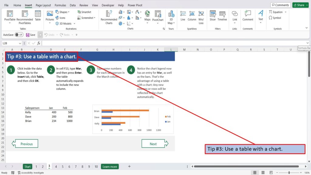
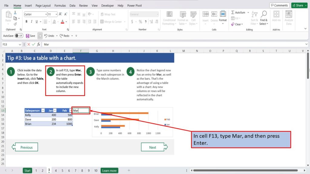
Click inside the data below.
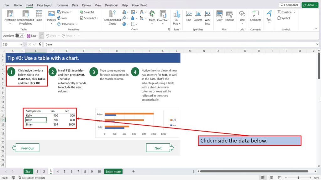
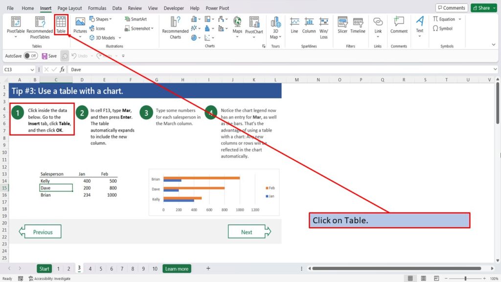
Choose the Insert tab.

Click on Table.
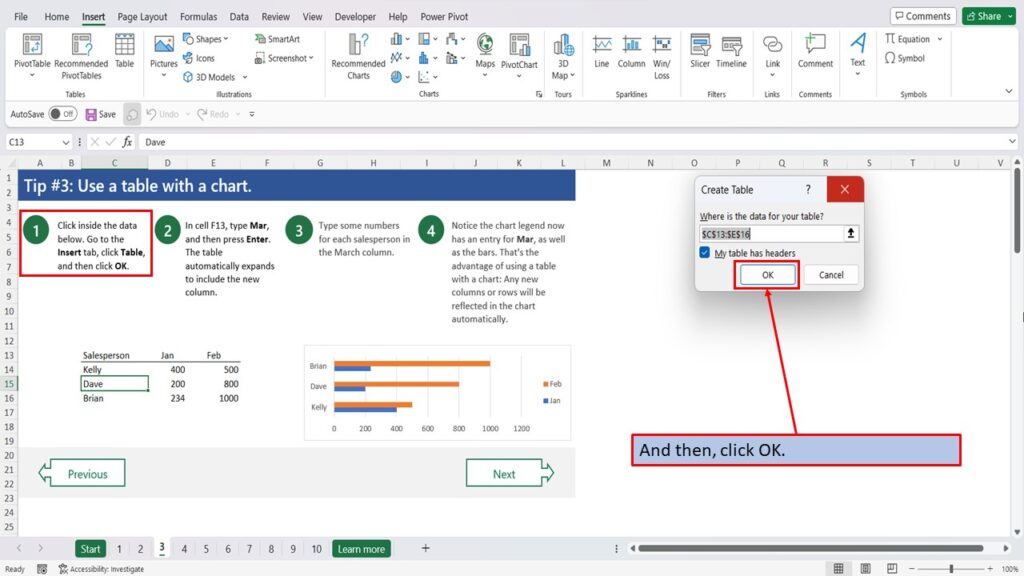
And then, click OK.
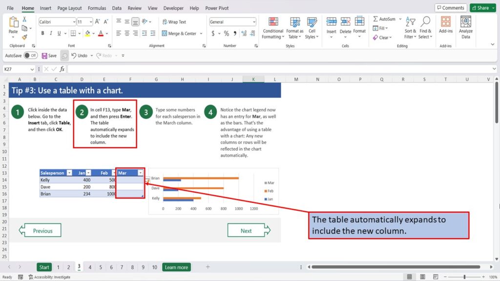
In cell F13, type March, and then press Enter.
The table, automatically expands to include the new column.
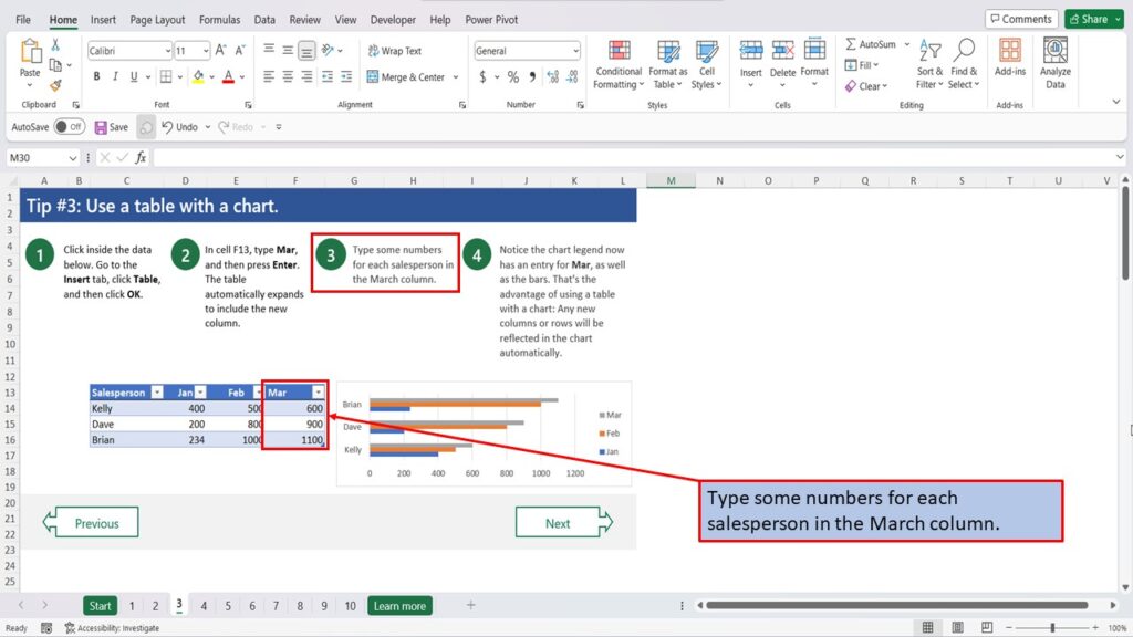
Type some numbers for each salesperson, in the March column.
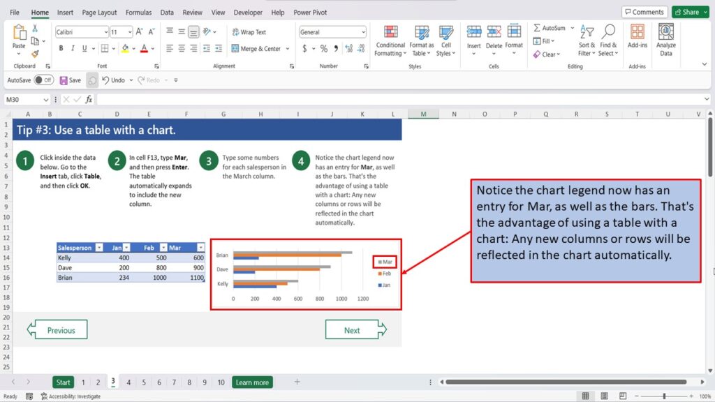
Notice the chart legend now has an entry for March, as well as the bars. That’s the advantage of using a table with a chart: Any new columns or rows will be reflected in the chart automatically.
View the Video Tutorial.
Download this tutorial in PDF by clicking the Download link below.
Tip # 1 | Press Alt + F1 to quickly make a chart
Tip # 2 | Select specific columns, before creating a chart
Tip # 3 | Use a table with a chart
Tip # 4 | Quickly filter data from a chart
Tip # 5 | Use Pivot Charts when your data isn’t summarized
Tip # 6 | Create multi-level labels
Tip # 7 | Use a secondary axis to create a combo chart
Tip # 8 | Hook up a chart title to a cell