
Hello, and welcome to Mark’s Excel Tips. Today, we are going to show you how to create a pie chart in Excel. Let’s get started.
Click here to view our video tutorial.
Click here to download our PDF tutorial.
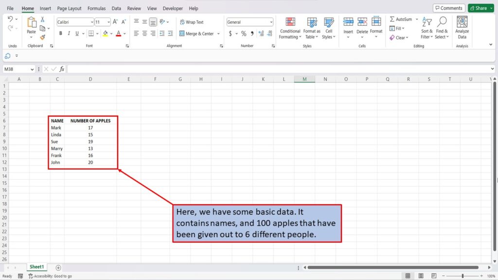
Here, we have some basic data. It contains names, and 100 apples that have been given out to 6 different people.
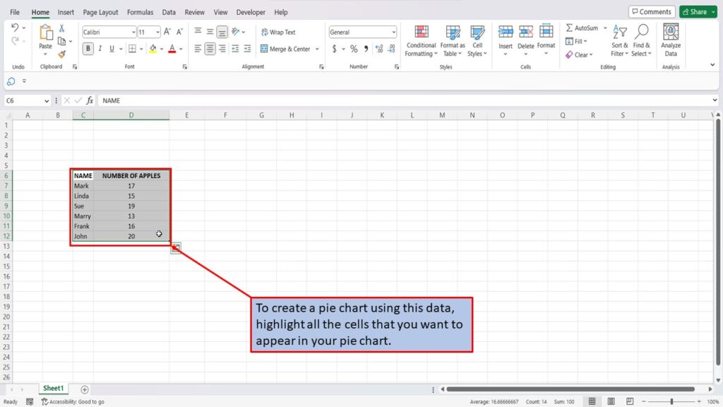
To create a pie chart using this data, highlight all the cells that you want to appear in your pie chart.
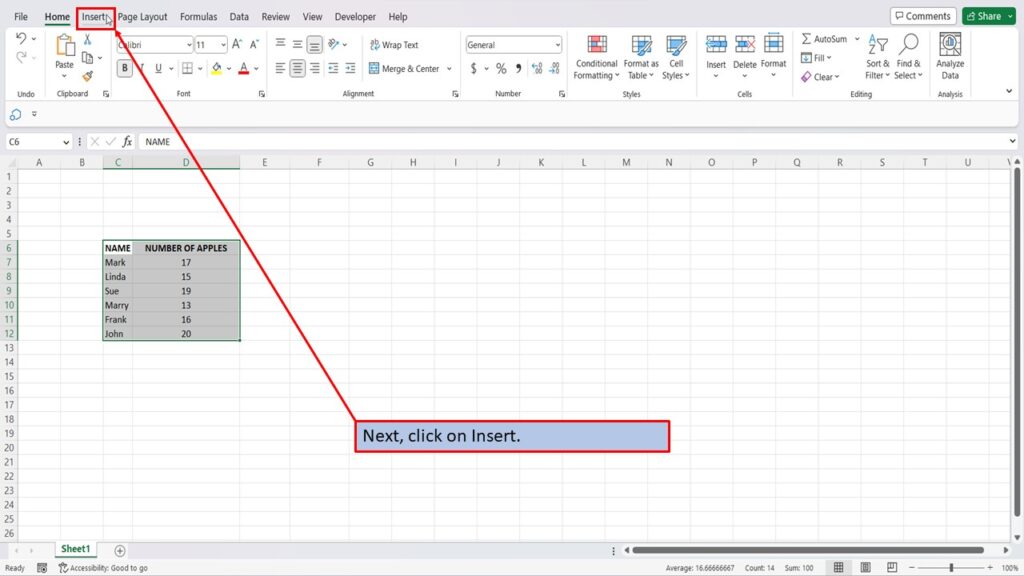
Next, click on Insert.
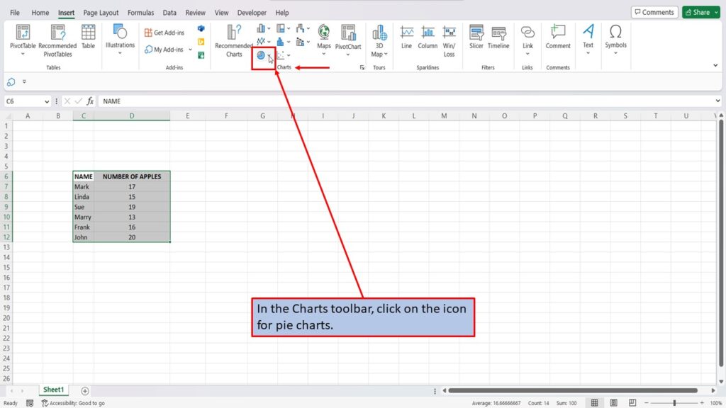
In the Charts toolbar, click on the icon for pie charts.
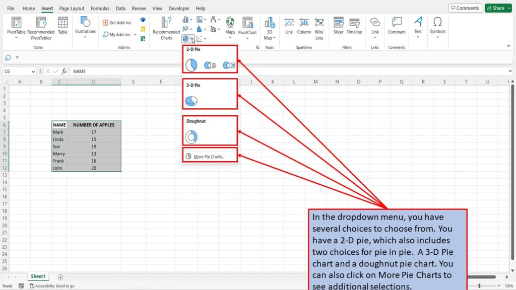
In the dropdown menu, you have several choices to choose from. You have a 2-D pie, which also includes two choices for pie of pie. A 3-D Pie chart and a doughnut pie chart. You can also click on More Pie Charts to see additional selections.
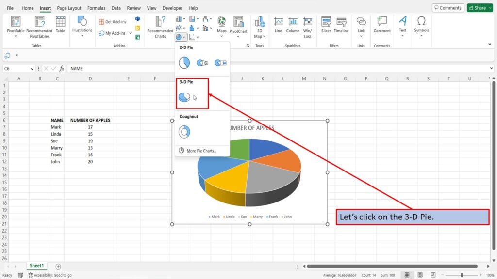
Let’s click on the 3-D Pie.
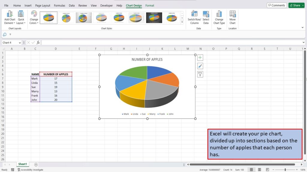
Excel will create your pie chart, divided up into sections based on the number of people, and the number of apples that each person has.
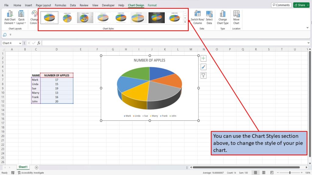
You can use the Chart Styles section above, to change the style of your pie chart.
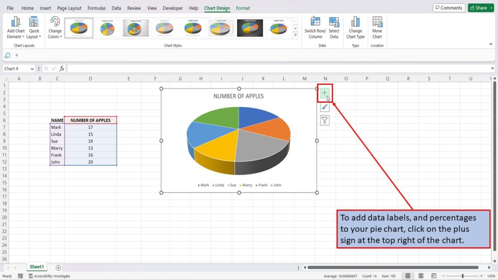
To add data labels, and percentages to your pie chart, click on the plus sign at the top right of the chart.
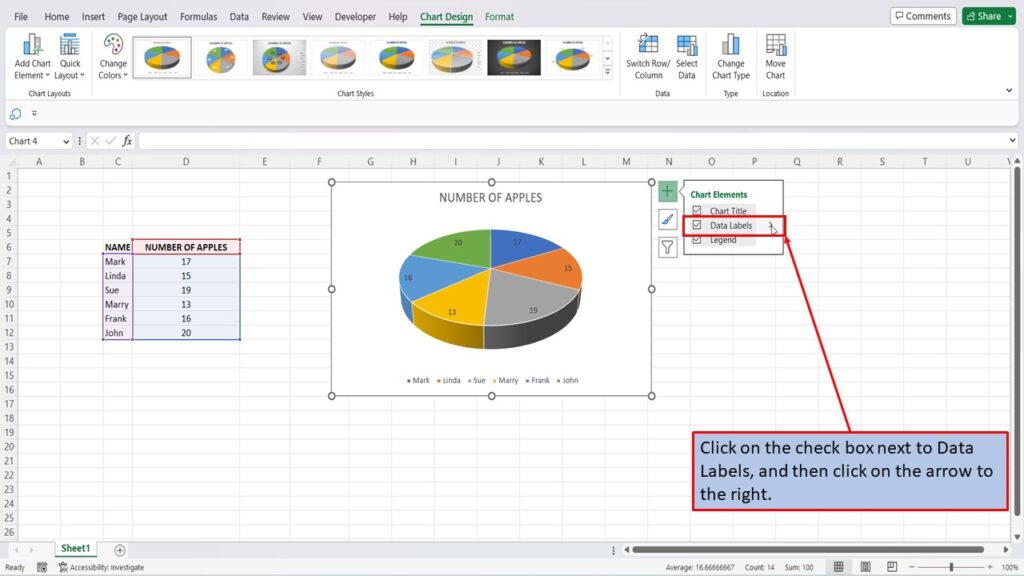
Click on the check box next to Data Labels, and then click on the arrow to the right.
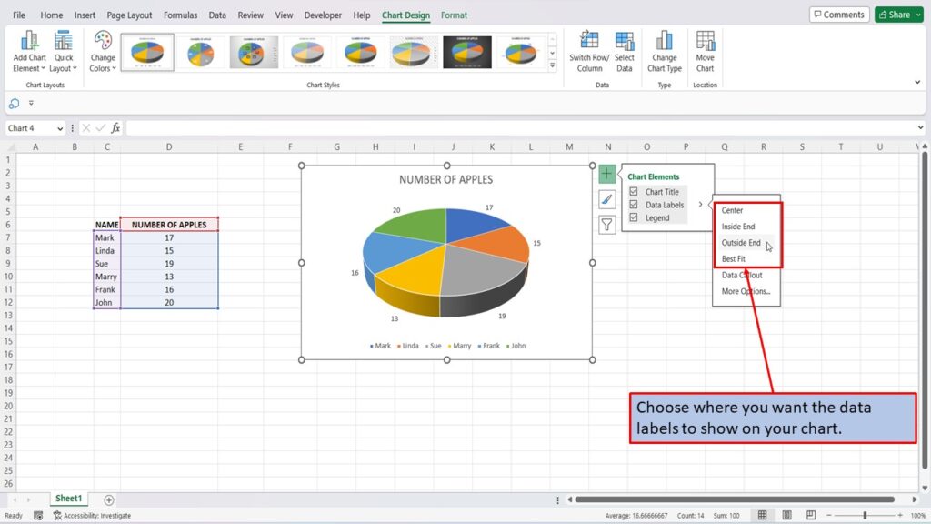
Choose where you want the data labels to show on your chart.
And then click on Data Callout.
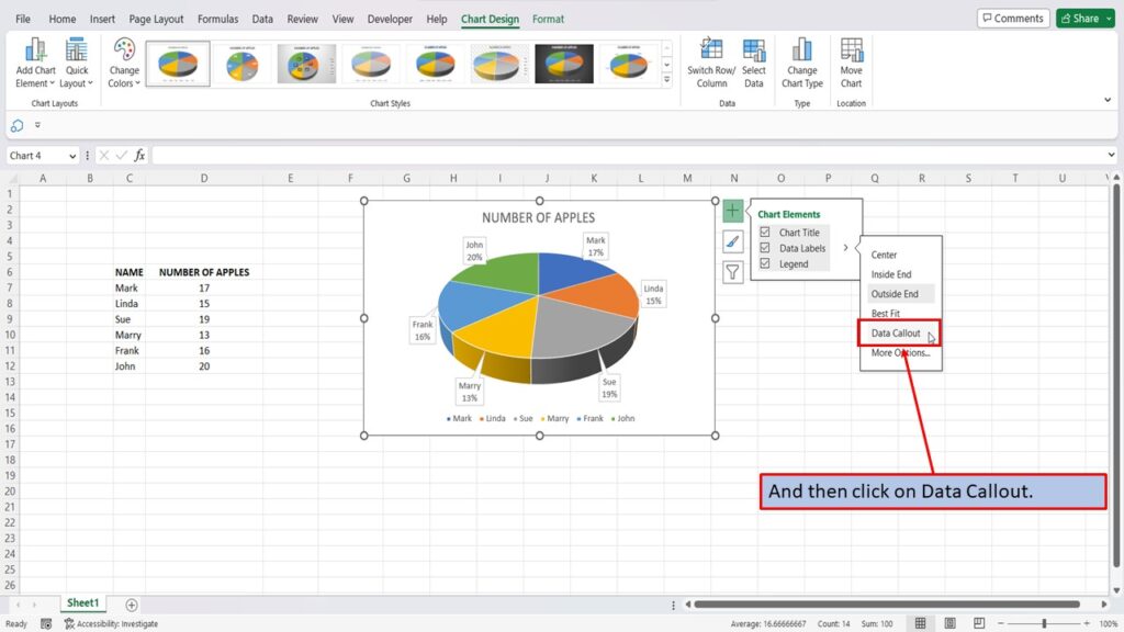
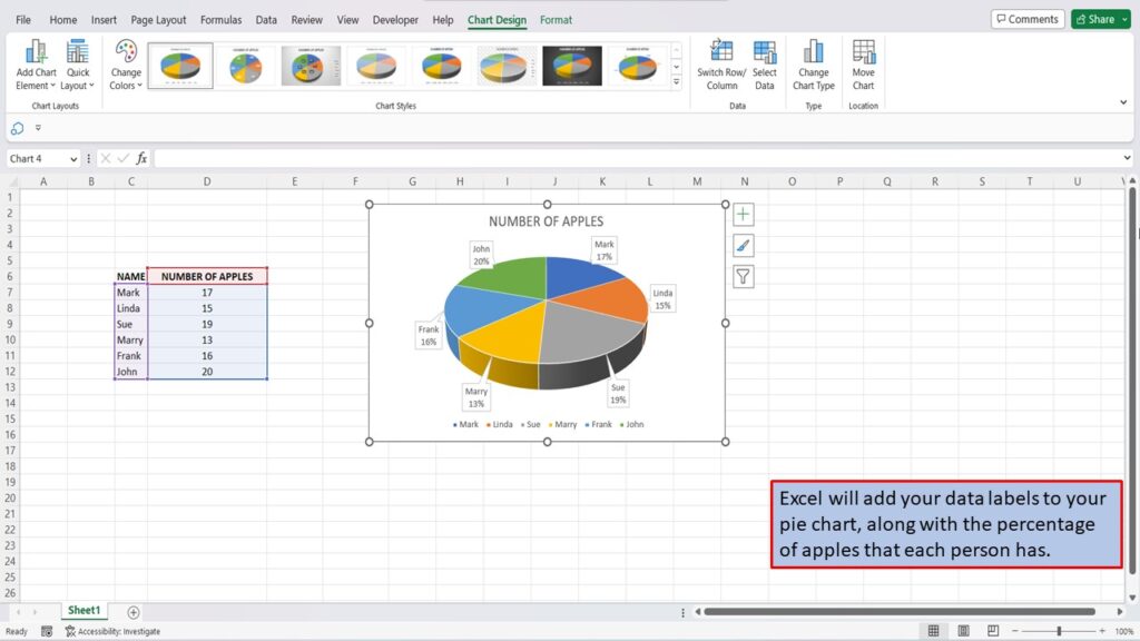
Excel will add your data labels to your pie chart, along with the percentage of apples that each person has.
View the Video Tutorial.
Download this tutorial in PDF by clicking the Download link below.