
Hello, and welcome to Mark’s Excel Tips. In this article, I will show you the seventh tip, in a series of 10, tips for Excel charts.
After going through these ten charting tips, you’ll be faster and more efficient than ever before. You can find the links to each of these 10 Excel tips at the bottom of this article. Let’s get started.
Click here to view our video tutorial.
Click here to download our PDF tutorial.
Tip #7: Use a secondary axis to create a combo chart.
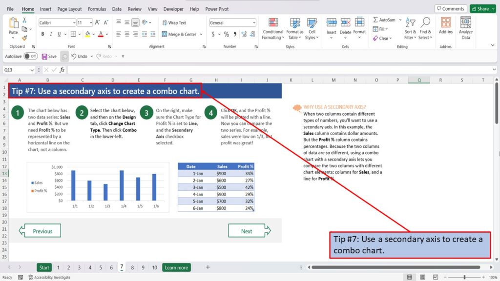
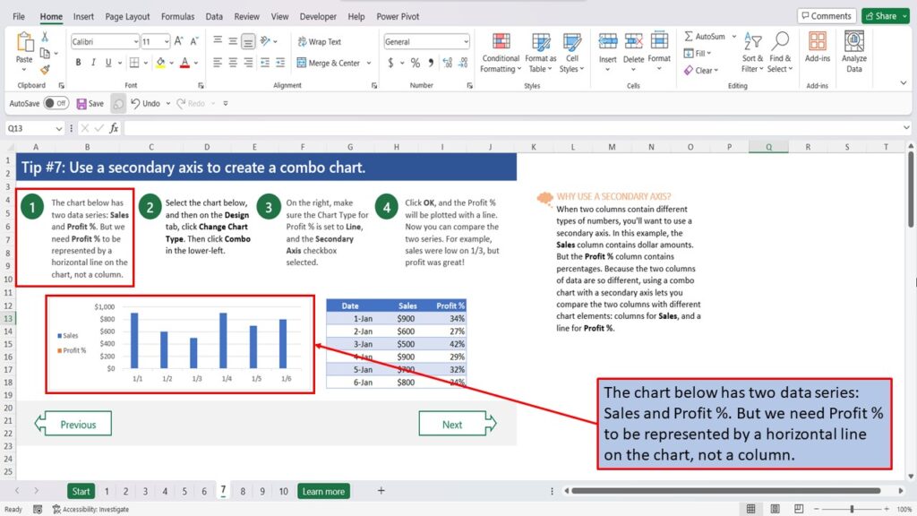
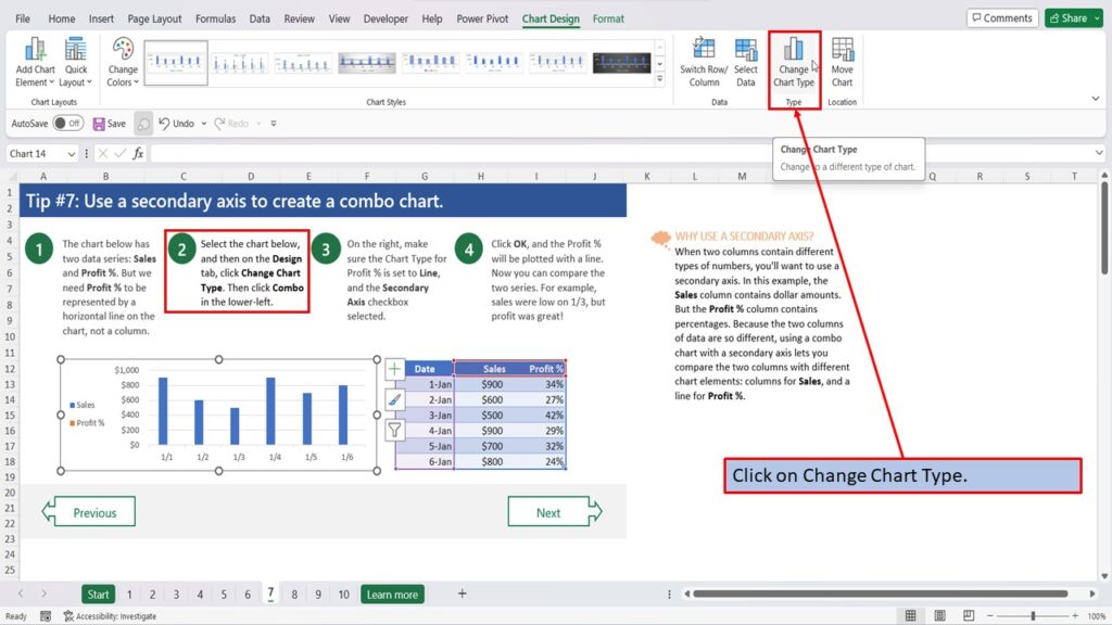
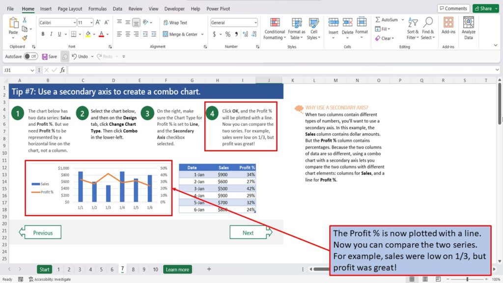
The chart below has two data series: Sales and Profit %. But we need Profit % to be represented by a horizontal line on the chart, not a column.
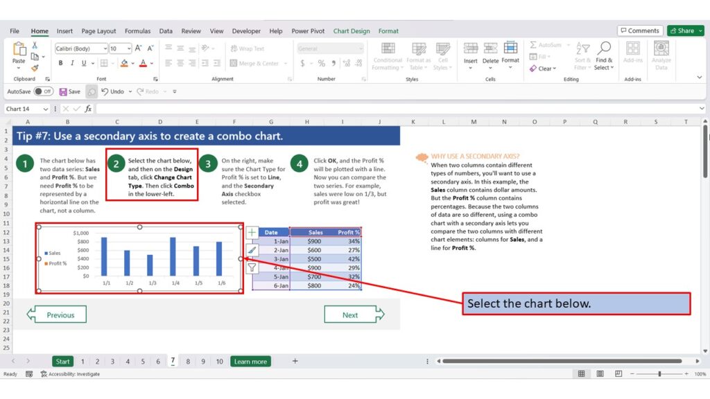
Select the chart below.
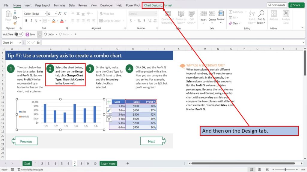
And then on the Design tab.
Click on Change Chart Type.
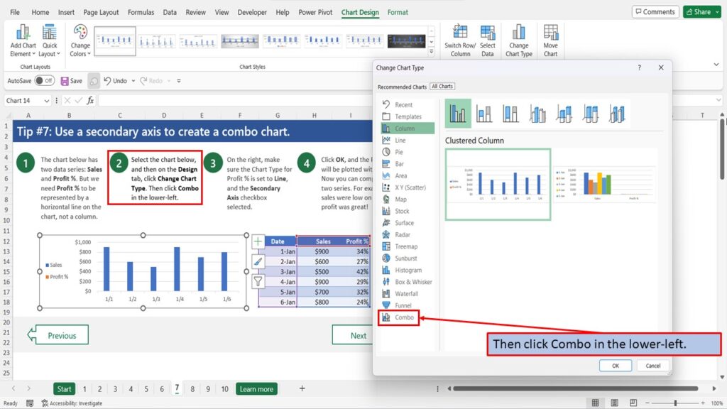
Then click Combo in the lower-left.
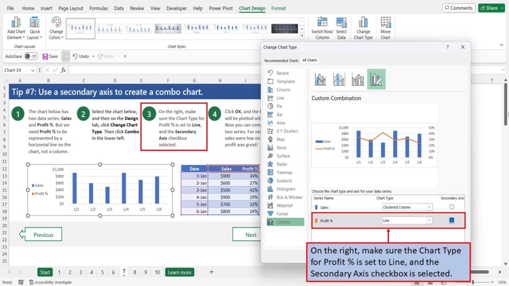
On the right, make sure the Chart Type for Profit % is set to Line, and the Secondary Axis checkbox is selected.
Click OK.
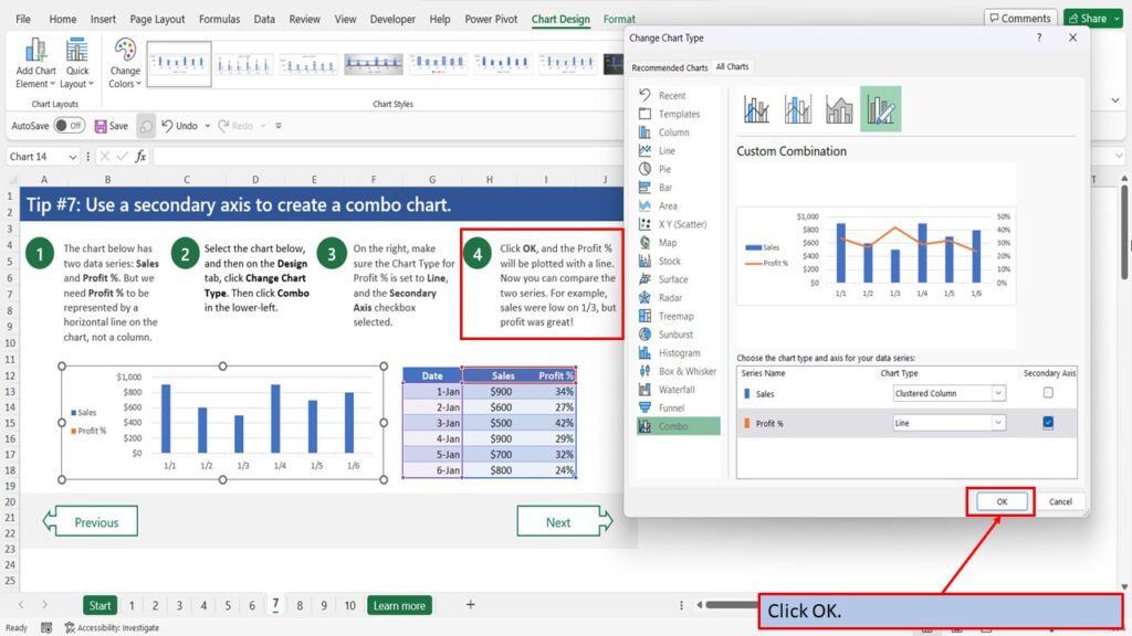
The Profit % is now plotted with a line. Now you can compare the two series. For example, sales were low on 1/3, but profit was great!
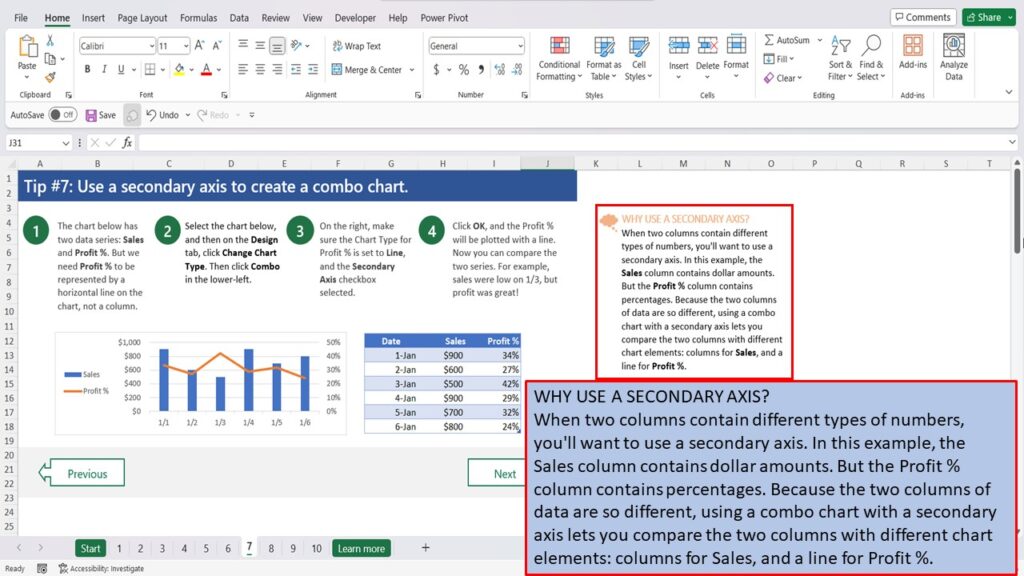
WHY USE A SECONDARY AXIS?
When two columns contain different types of numbers, you’ll want to use a secondary axis. In this example, the Sales column contains dollar amounts. But the Profit % column contains percentages. Because the two columns of data are so different, using a combo chart with a secondary axis lets you compare the two columns with different chart elements: columns for Sales, and a line for Profit %.
Need More Help?
View the Video Tutorial.
Download this tutorial in PDF by clicking the Download link below.
Tip # 1 | Press Alt + F1 to quickly make a chart
Tip # 2 | Select specific columns, before creating a chart
Tip # 3 | Use a table with a chart
Tip # 4 | Quickly filter data from a chart
Tip # 5 | Use Pivot Charts when your data isn’t summarized
Tip # 6 | Create multi-level labels
Tip # 7 | Use a secondary axis to create a combo chart
Tip # 8 | Hook up a chart title to a cell