
Hello, and welcome to Mark’s Excel Tips. In this article, I will show you the sixth tip, in a series of 10, tips for Excel charts.
After going through these ten charting tips, you’ll be faster and more efficient than ever before. You can find the links to each of these 10 Excel tips at the bottom of this article. Let’s get started.
Click here to view our video tutorial.
Click here to download our PDF tutorial.
Tip #6: Create multi-level labels.
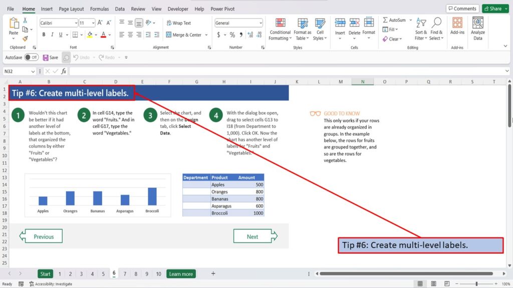
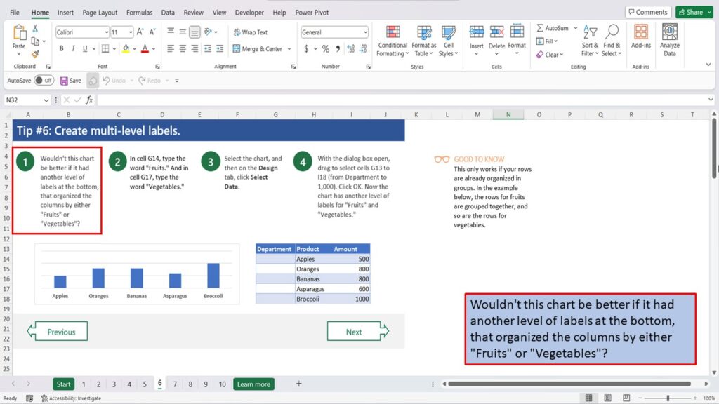
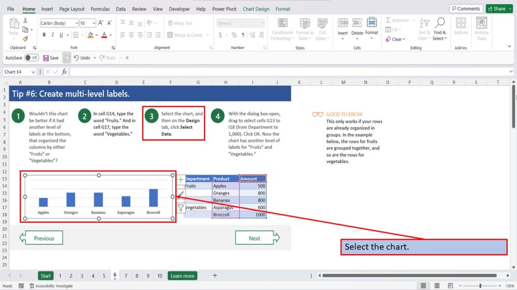
Wouldn’t this chart be better if it had another level of labels at the bottom, that organized the columns by either “Fruits” or “Vegetables”?
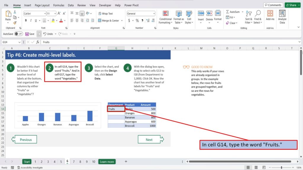
In cell G14, type the word “Fruits.”
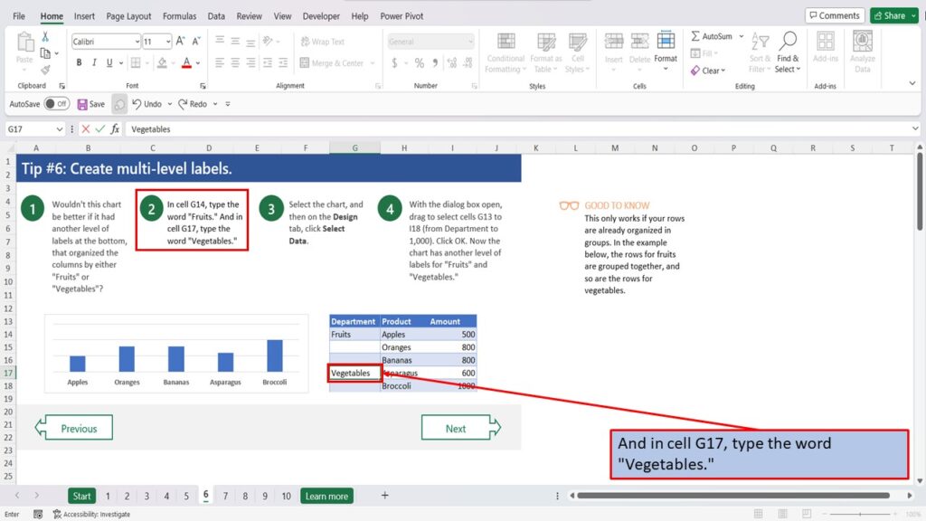
And in cell G17, type the word “Vegetables.”
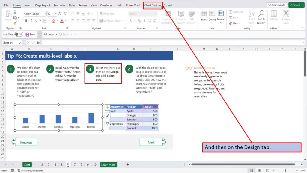
Select the chart.
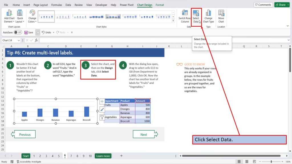
And then on the Design tab.
Click Select Data.
With the dialog box open, drag to select cells G13 to I18 (from Department to 1,000).
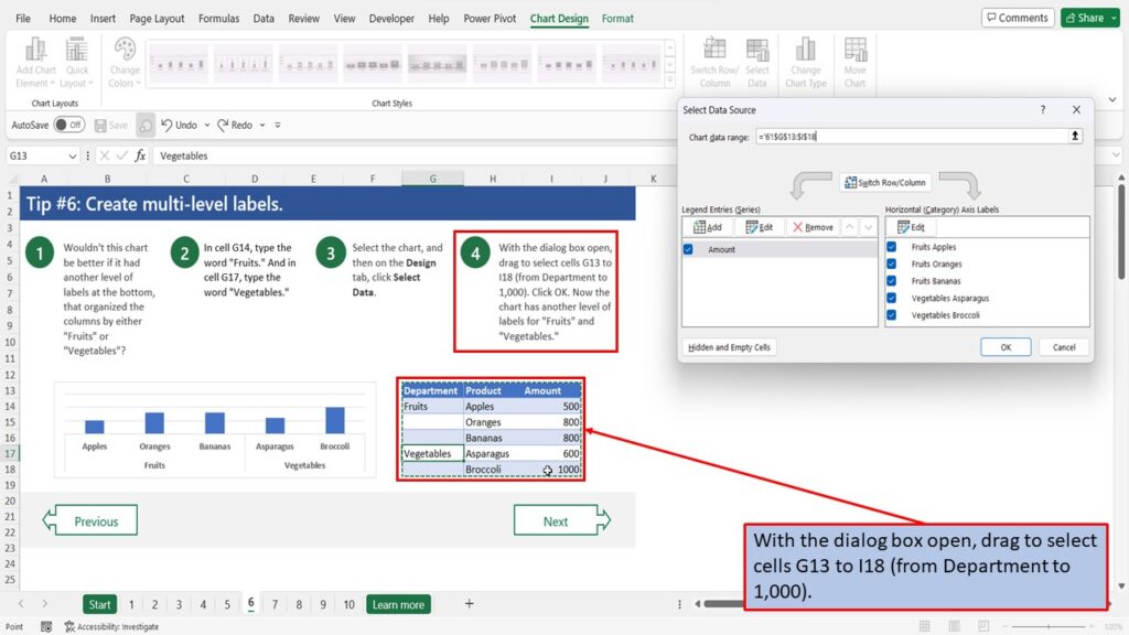
Click OK.
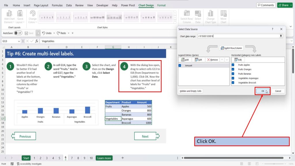
Now the chart has another level of labels for “Fruits” and “Vegetables.”
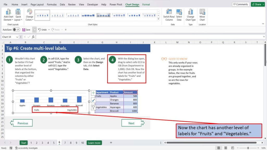
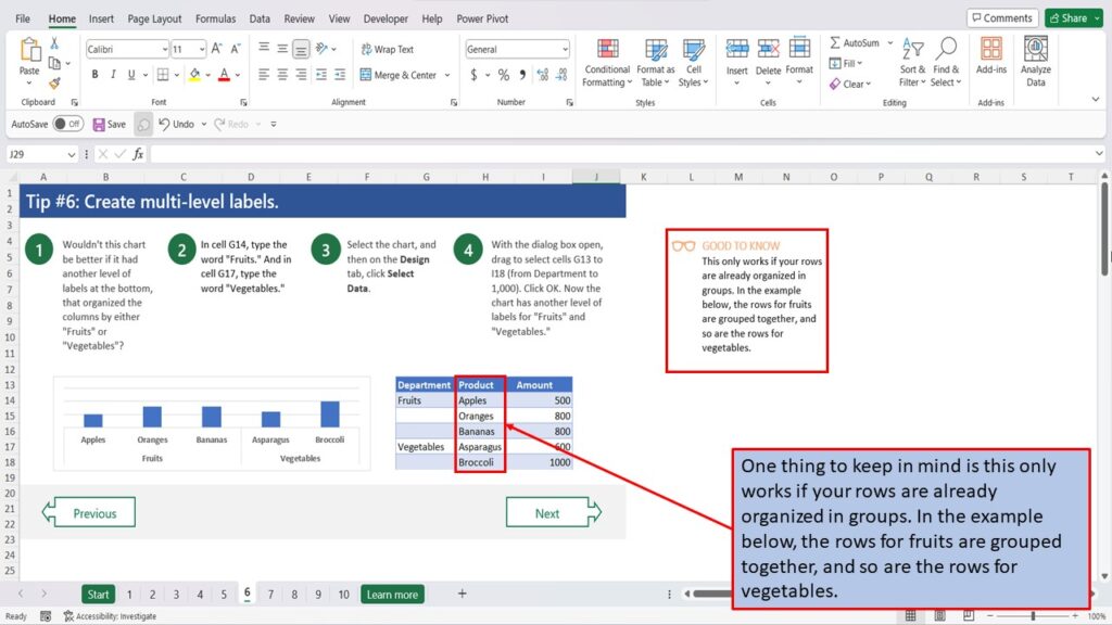
One thing to keep in mind is this only works if your rows are already organized in groups. In the example below, the rows for fruits are grouped together, and so are the rows for vegetables.
View the Video Tutorial.
Download this tutorial in PDF by clicking the Download link below.
Tip # 1 | Press Alt + F1 to quickly make a chart
Tip # 2 | Select specific columns, before creating a chart
Tip # 3 | Use a table with a chart
Tip # 4 | Quickly filter data from a chart
Tip # 5 | Use Pivot Charts when your data isn’t summarized
Tip # 6 | Create multi-level labels
Tip # 7 | Use a secondary axis to create a combo chart
Tip # 8 | Hook up a chart title to a cell